
Hello, welcome back to 24 Days of Dupes 2024. Below you’ll find the inks for days 12-18. If you have a suggestion for a possible dupe for any of these inks, let me know in the comments, and I’ll add it to the wrap-up post.
Some info:
- You can click the swatch images to view them larger.
- I swatched each ink with a small (#2) paintbrush and wrote with a Sailor Compass Hocoro Dip Pen.
- All inks are swatched on Muji A5 loose leaf paper in dot grid ruling
- While I try to edit the images so they look as close to real life as possible, I can’t guarantee that the color you see on your screen will be true to life. However, with all the dupes on the same page, you’ll see how the colors look in relation to each other, which is the main point of these posts.
- I can’t fairly call any ink a perfect color match, as I’m not comparing them scientifically, I’m just using my eyes. Therefore, I won’t be going any further than calling an ink a “near-perfect color match.”
- Reminder: I’m not attempting to dupe the special properties of the inks — sheen, shimmer, etc. — only the base color.
- When I mention “writing samples,” I’m talking about where I’ve written 2024 Colorvent (Calendar) on the right-hand side of the page.
Enjoy, and happy inking!
Jump to a day: Sunbeam| ⇣ Neptune Occultation | ⇣ Pulsar Pulse | ⇣ Brinicles | ⇣ Eclipse Silence | ⇣ NGC 2264 | ⇣ Morning Glow
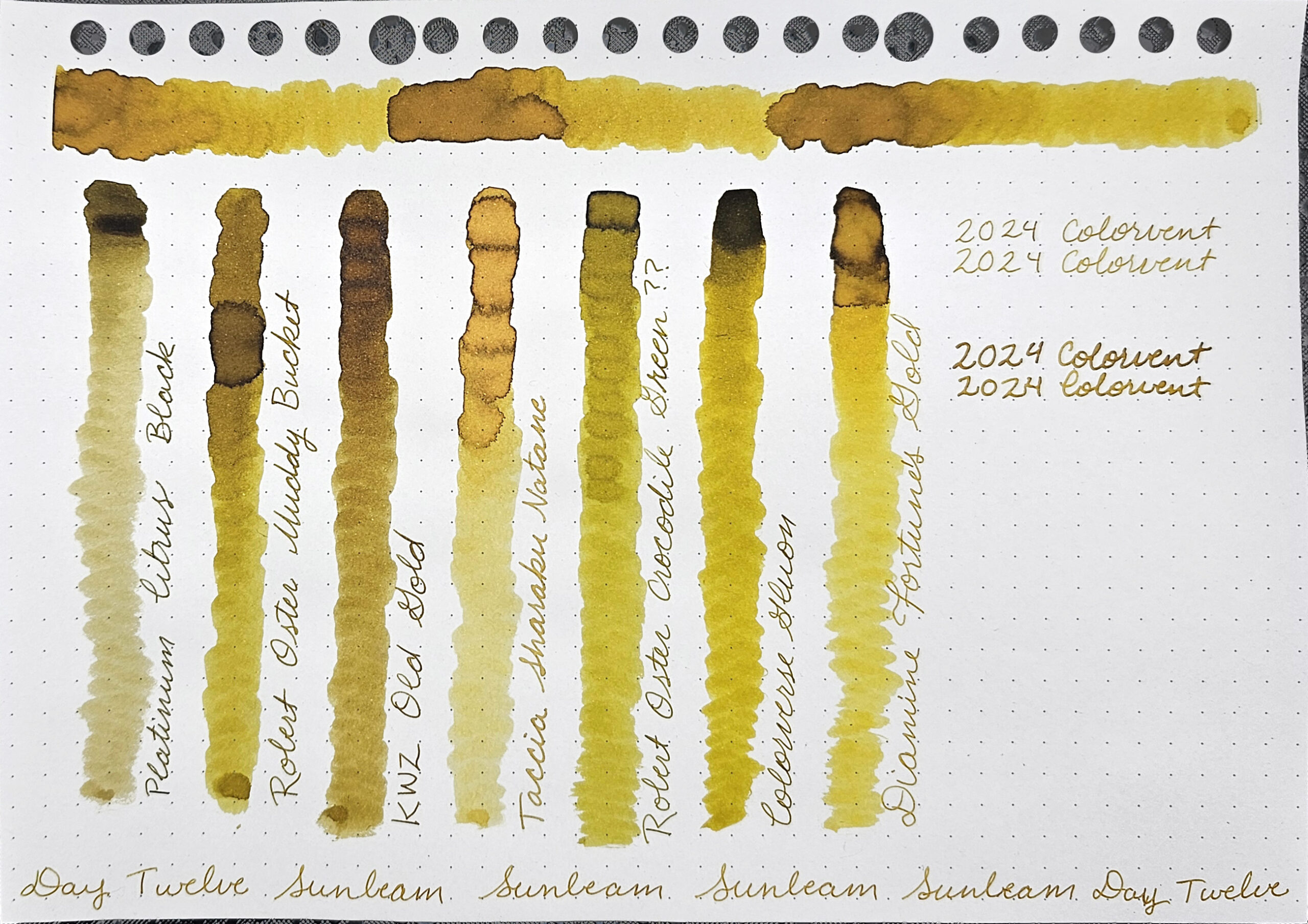
Day 12: Sunbeam

Sunbeam is a slightly greenish-gold with enough shading to give it character. In the heaviest ink deposits, it looks warmer, more like an antique gold than a green-gold.
Colorverse’s description for day 12 is, “Sunbeam captures the warmth and vibrancy of the moment when the sun’s light hits the earth.”
Comparison Inks
- Platinum Citrus Black is too muted, too green, and shades too dark.
- Robert Oster Muddy Bucket is a hint too green and shades too dark. It also has the nearly-black ring around the heaviest ink deposits, which Sunbeam doesn’t have.
- KWZ Old Gold is too dark, although it looks like it could be the right hue if it were lighter.
- Taccia Sharaku Natane is significantly too light, but could be the right hue.
- I don’t know if my sample changed color or if a sample was mislabeled, but it’s definitely NOT Robert Oster Crocodile Green. It is however a bit too green.
- Colorverse Gluon is too green and shades significantly too dark.
- Diamine Fortune’s Gold is a bit too light, although it’s capable of shading darker. I let the shimmer settle completely, but you can see a couple of sparkles in the heaviest ink deposit.
Best Match
The best color match for Sunbeam among those I tested was Fortune’s Gold but I wouldn’t consider it a dupe given that it’s noticeably lighter.
Jump to a day: ⇡ Sunbeam| Neptune Occultation | ⇣ Pulsar Pulse | ⇣ Brinicles | ⇣ Eclipse Silence | ⇣ NGC 2264 | ⇣ Morning Glow | ⤒ Back to Top
Day 13: Neptune Occultation

Neptune Occultation is a deep navy blue — or blue-black depending on your preferred terminology. It shades to off-black and has the tiniest hint of copper sheen in the heaviest ink deposits.
Colorverse’s description for day 13 is, “Neptune Occultation is a color inspired by the phenomenon of Neptune being occulted by other celestial bodies.”
Comparison Inks
- Diamine Regency Blue
- De Atramentis Document Blue is about the right hue, but far too light.
- Diamine Tudor Blue is a bit too light, but also too vibrant. It tends more toward royal blue than navy blue.
Best Match
The best color match for Neptune Occultation among those I tested was Regency Blue which is a near-perfect color match. The main difference between the two is that Regency Blue has more sheen.

Jump to a day: ⇡ Sunbeam| ⇡ Neptune Occultation | Pulsar Pulse | ⇣ Brinicles | ⇣ Eclipse Silence | ⇣ NGC 2264 | ⇣ Morning Glow | ⤒ Back to Top
Day 14: Pulsar Pulse

Pulsar Pulse is a deceptively unique turquoise with fuchsia/red sheen. I was sure it would match Robert Oster’s turquoises, but Pulsar Pulse is deeper and has more sheen. In writing samples, especially, it’s approaching sheen monster status.
Colorverse’s description for day 14 is, “Pulsar Pulse is a color inspired by the powerful magnetic field and radio waves of a rapidly rotating neutron star, a pulsar.”
Comparison Inks
- Robert Oster Blue Water Ice is too light, a bit too blue, and doesn’t sheen.
- Van Dieman’s Blue Jay Wing is completely wrong, with no match at all among hue, saturation, or lightness.
- Robert Oster Taiwan Blue is too light and doesn’t sheen enough.
- Robert Oster Soda Pop Blue is slightly too blue, too light, and doesn’t sheen enough.
- Robert Oster Fire & Ice is basically the same hue, but it’s too light and doesn’t sheen enough.
- J. Herbin Bleu Pervenche is too blue, too light, and doesn’t sheen enough.
Best Match
The best color match for Pulsar Pulse among those I tested was Fire & Ice but I wouldn’t consider it a dupe. If you aren’t a fan of dark colors or sheen, you may prefer Fire & Ice, since you can actually see the color when writing.


Jump to a day: ⇡ Sunbeam| ⇡ Neptune Occultation | ⇡ Pulsar Pulse | Brinicles | ⇣ Eclipse Silence | ⇣ NGC 2264 | ⇣ Morning Glow | ⤒ Back to Top
Day 15: Brinicles

Brinicles is a lighter, muted version of Pulsar Pulse. It makes me think of the clear waters of the Caribbean.
Colorverse’s description for day 15 is, “Brinicles is a color inspired by the cold, mysterious ice picks or salt pillars that form beneath sea ice.”
Comparison Inks
- Dominant Industry Horizon is too light and a bit too vibrant.
- Colorverse Dokdo leans too green and is a bit too dark.
- Jacques Herbin Turquoise de Perse Is around the same shade, but is too vibrant.
- Octopus Fluids Petrol Deer is too light and too muted.
- Sailor Jentle Yama Dori is significantly too dark, but it could be roughly the same hue.
- Colorverse Rainy Day is both too dark and too light as it shades a lot. It also seems to be a hint too green.
- Robert Oster Ocean is too blue and too light.
- Diamine Subzero
Best Match
The best color match for Brinicles among those I tested was Subzero which is a near-perfect color match. In places, it looks slightly darker. Subzero has shimmer which I let settle, but is still easily visible in the swatch.

Jump to a day: ⇡ Sunbeam| ⇡ Neptune Occultation | ⇡ Pulsar Pulse | ⇡ Brinicles | Eclipse Silence | ⇣ NGC 2264 | ⇣ Morning Glow | ⤒ Back to Top
Day 16: Eclipse Silence

Eclipse Silence is a solid black. It looks like it has a hint of red in the swatch, but there was no red in the doodle when I watered it down. It also has a warm black sheen in heavy ink deposits.
Colorverse’s description for day 16 is, “Eclipse Silence is a color that captures the darkness and silence of the moment when the moon completely covers the sun, temporarily blocking out the sun’s light.”
Comparison Inks
- Colorverse Sunspot is slightly less solid in the swatch, but the writing actually looks darker because it doesn’t have the sheen.
- Platinum Carbon Black has a cool black sheen in heavy ink deposits that makes it look a little different from Eclipse Silence
- Ink Institute Cat at Midnight Is a cool black and is less solid. The writing looks darker because it doesn’t have the sheen.
- Platinum Chou Kuro is significantly darker and looks very different since it’s a pigment ink rather than a dye ink.
- Diamine Solstice
Best Match
The best color match for Eclipse Silence among those I tested was Solstice which is a near-perfect color match. It has the same kind of warm sheen, although as a halo rather than the entire ink “puddle.”

Jump to a day: ⇡ Sunbeam| ⇡ Neptune Occultation | ⇡ Pulsar Pulse | ⇡ Brinicles | ⇡ Eclipse Silence | NGC 2264 | ⇣ Morning Glow | ⤒ Back to Top
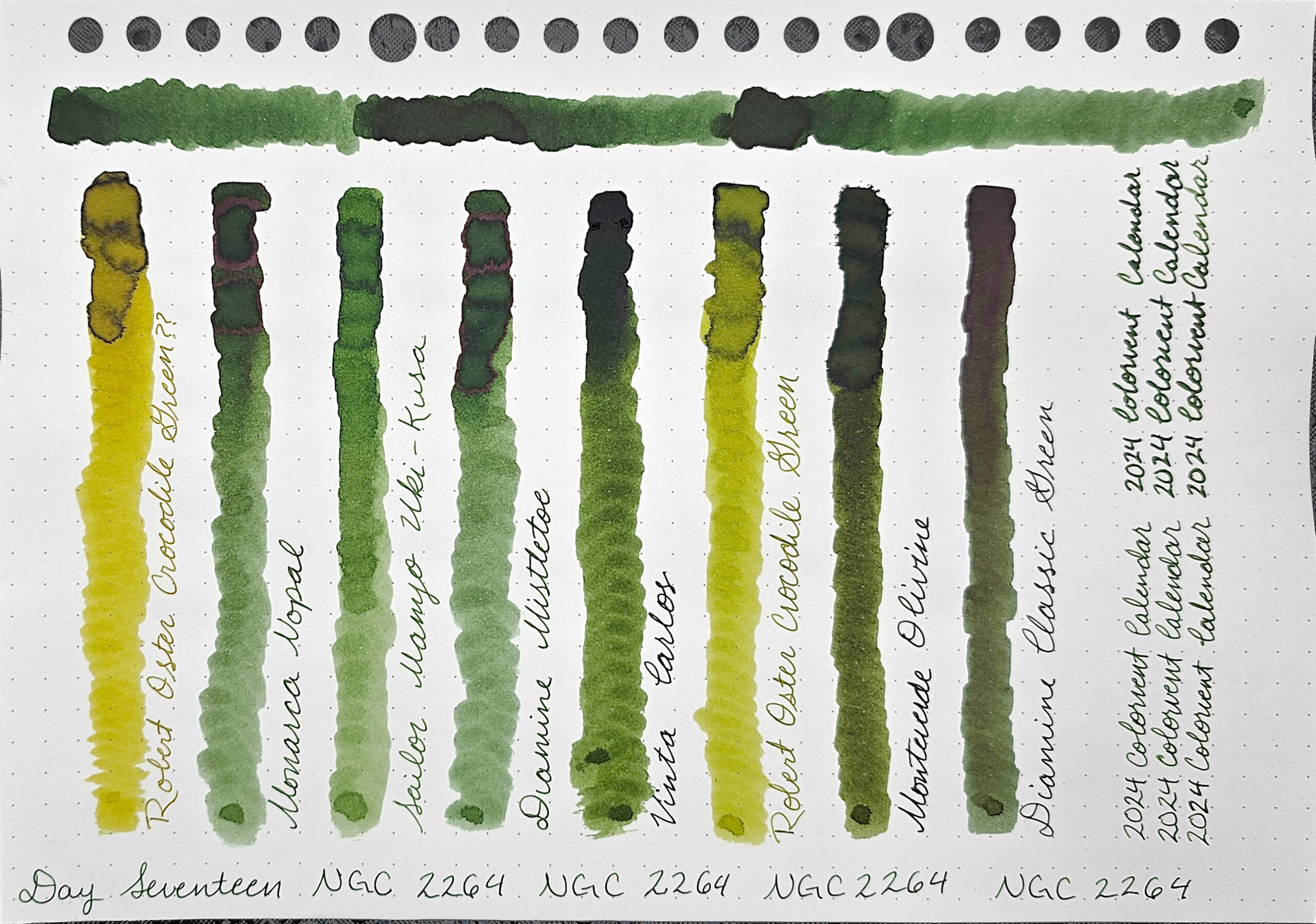
Day 17: NGC 2264

NGC 2264 is a nice, middle-of-the-road green. It doesn’t lean particularly yellow nor particularly blue. It has a decent amount of shading that shows the tiniest bit of red as a halo around the heaviest ink deposits like it wants to sheen.
Colorverse’s description for day 17 is, “NGC 2264 was inspired by a photo of the galaxy taken last winter. It reminds me of a Christmas tree.”
Comparison Inks
- This is where I discovered that my sample of Robert Oster Crocodile Green is not — or no longer is — the actual color. It is far too yellow
- Monarca Nopal
- Sailor Manyo Uki-Kusa is a hint too yellow and does not shade dark enough, making it too light.
- Diamine Mistletoe
- Vinta Carlos is too dark and a bit too yellow.
- This swatch of Robert Oster Crocodile Green is a new sample I purchased that is different from both the previous sample I had and the original swatch I have in my swatch book. This sample is too yellow, although not so much as the old sample, and too light.
- Monteverde Olivine is too dark, and I think it’s a hint too yellow, although it’s hard to tell for certain.
- Diamine Classic Green is significantly too dark, but it has the same reddish tinge that hints at sheening, and I think it may be roughly the same hue.
Best Match
The best color matches for NGC 2264 among those I tested were Nopal (bottom writing sample) and Mistletoe (top writing sample) which are near-perfect color matches.
Jump to a day: ⇡ Sunbeam| ⇡ Neptune Occultation | ⇡ Pulsar Pulse | ⇡ Brinicles | ⇡ Eclipse Silence | ⇡ NGC 2264 | Morning Glow | ⤒ Back to Top
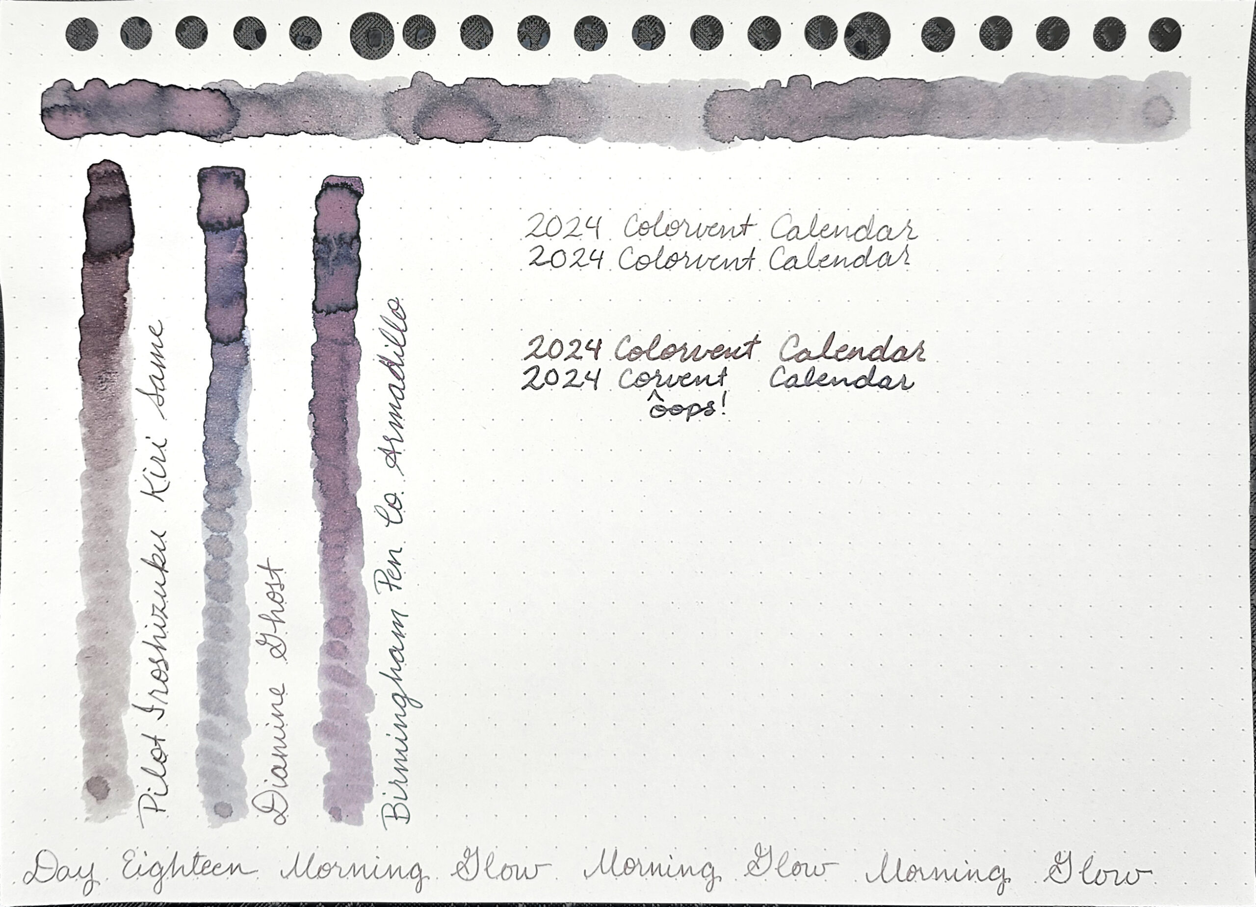
Day 18: Morning Glow

Morning Glow is a multishading ink that looks gray at first glance, but has a lot of peachy-pink in it. Even at its least saturated, there is still some pink.
Colorverse’s description for day 18 is, “Morning Glow is a color inspired by the moment when the morning dawns and the sky is bathed in a beautiful light.”
Comparison Inks
- Pilot Iroshizuku Kiri-Same is too muted for Morning Glow’s most colorful shading, and too vibrant for Morning Glow’s normal writing. Overall, it’s a bit too brown, although it’s similar in lightness and amount of shading.
- Diamine Ghost has very similar shading properties, going pink in the heaviest ink deposits, but is otherwise too cool, with it’s gray areas looking almost blue. It is, however, roughly the same lightness.
- Birmingham Pen Co. Armadillo is too purple, but is about the same lightness.
Best Match
The best color match for Morning Glow among those I tested was Ghost which is definitely not a dupe. You can see how much grayer Ghost is in the writing samples. Morning Glow requires less ink laid down to shade, so it’s fairly pink in the writing samples.
Jump to a day: ⇡ Sunbeam| ⇡ Neptune Occultation | ⇡ Pulsar Pulse | ⇡ Brinicles | ⇡ Eclipse Silence | ⇡ NGC 2264 | ⇡ Morning Glow | ⤒ Back to Top
Thanks for reading to the end, I hope you enjoyed my post. What was your favorite color from this week? Let me know in the comments! I’d love to hear from you.
Make sure to subscribe to my blog or follow me on Instagram so you don’t miss any posts. I generally post at least once a week.