
Hello, welcome to the first post of 24 Days of Dupes 2024. Below you’ll find the inks for days 1-4. If you have a suggestion for a possible dupe for any of these inks, let me know in the comments, and I’ll add it to the wrap-up post.
Some info:
- You can click the swatch images to view them larger.
- I swatched each ink with a small (#2) paintbrush and wrote with a Sailor Compass Hocoro Dip Pen.
- All inks are swatched on Muji A5 loose leaf paper in dot grid ruling
- While I try to edit the images so they look as close to real life as possible, I can’t guarantee that the color you see on your screen will be true to life. However, with all the dupes on the same page, you’ll see how the colors look in relation to each other, which is the main point of these posts.
- I can’t fairly call any ink a perfect color match, as I’m not comparing them scientifically, I’m just using my eyes. Therefore, I won’t be going any further than calling an ink a “near-perfect color match.”
- Reminder: I’m not attempting to dupe the special properties of the inks — sheen, shimmer, etc. — only the base color.
Enjoy, and happy inking!
Jump to a day: Supergiant | ⇣ Edge of Night | ⇣ Moonlit Veil | ⇣ Sailing Stones
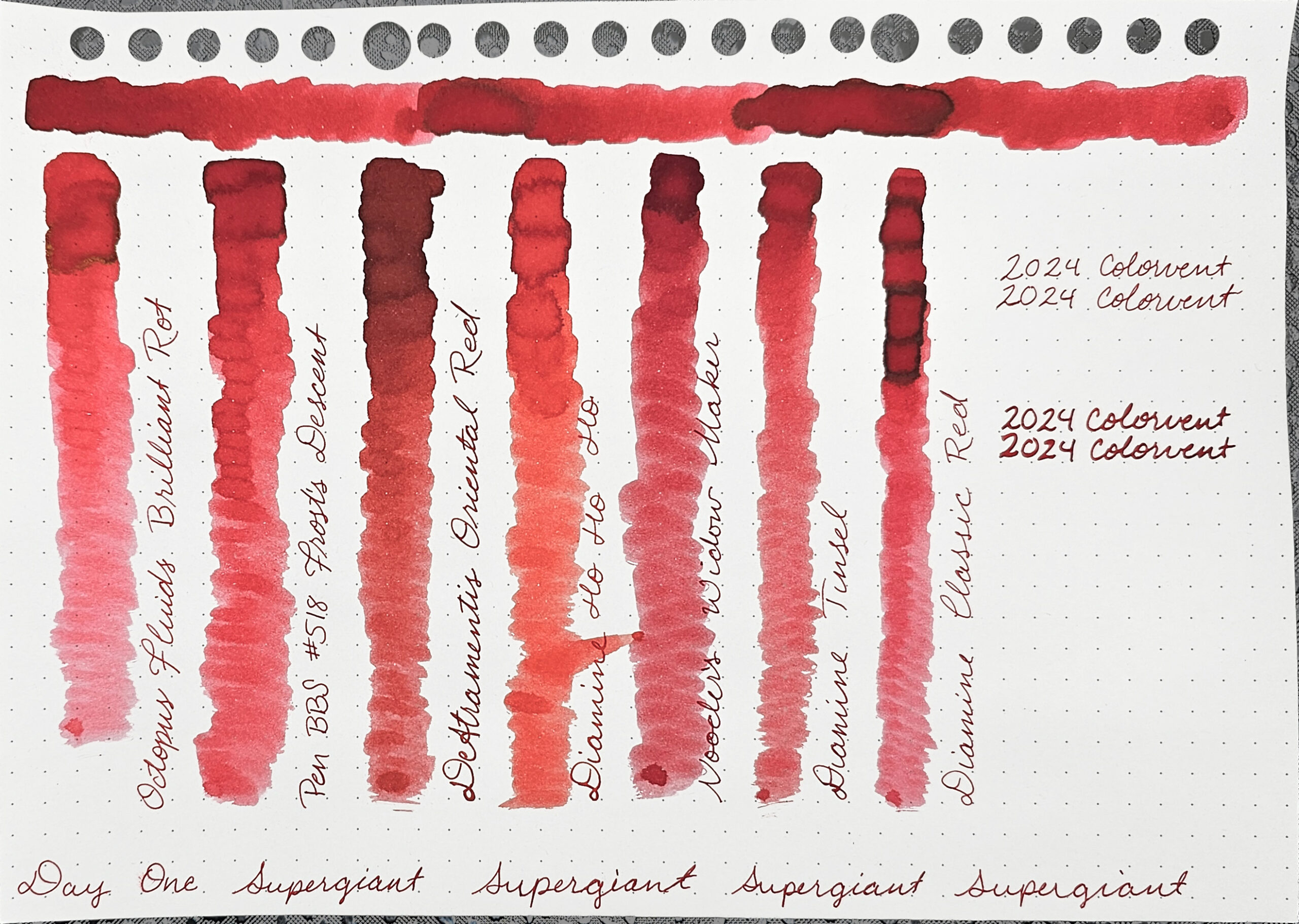
Day 1: Supergiant

Supergiant is a true red that has significant shading. When enough ink is put down, it also has one of those dark gray/black “auras” you see when an ink wants to sheen but doesn’t have the right kinds of dye to do so.
Colorverse’s description for day 1 is, “Supergiant is a color inspired by supergiants, which are hot, bright stars.”
Comparison Inks
From left to right, I compared the following inks to Supergiant:
- Octopus fluids Brilliant Rot leans too much toward pink and does not shade anywhere near as much. However, it does have the same type of “aura,” although it leans toward green.
- Pen BBS #518 Frost’s Descent
- DeAtramentis Oriental Red is not the right hue; it leans toward burgundy. The shading level appears to be roughly the same, though.
- Diamine Ho Ho Ho is slightly too yellow. It’s not an orange-red, but it is more orange than Supergiant. It also does not shade as much.
- Noodler’s Widow Maker is noticeably darker and it has too much blue in it, but it has the same amount of shading.
- Diamine Tinsel is slightly off in hue, leaning slightly too blue, I think, and doesn’t shade as much. Tinsel is a shimmer ink, but I let the shimmer settle before swatching it.
Best Match
The best color match for Supergiant among those I tested was Frost’s Descent. While it doesn’t shade quite as much, the base color is a near-perfect match. Unfortunately, Pen BBS inks have gotten harder to find — at least in the USA — since I bought my sample. So, as an alternative, Tinsel is also a pretty good match.
Jump to a day: ⇡ Supergiant | Edge of Night | ⇣ Moonlit Veil | ⇣ Sailing Stones | ⤒ Back to Top
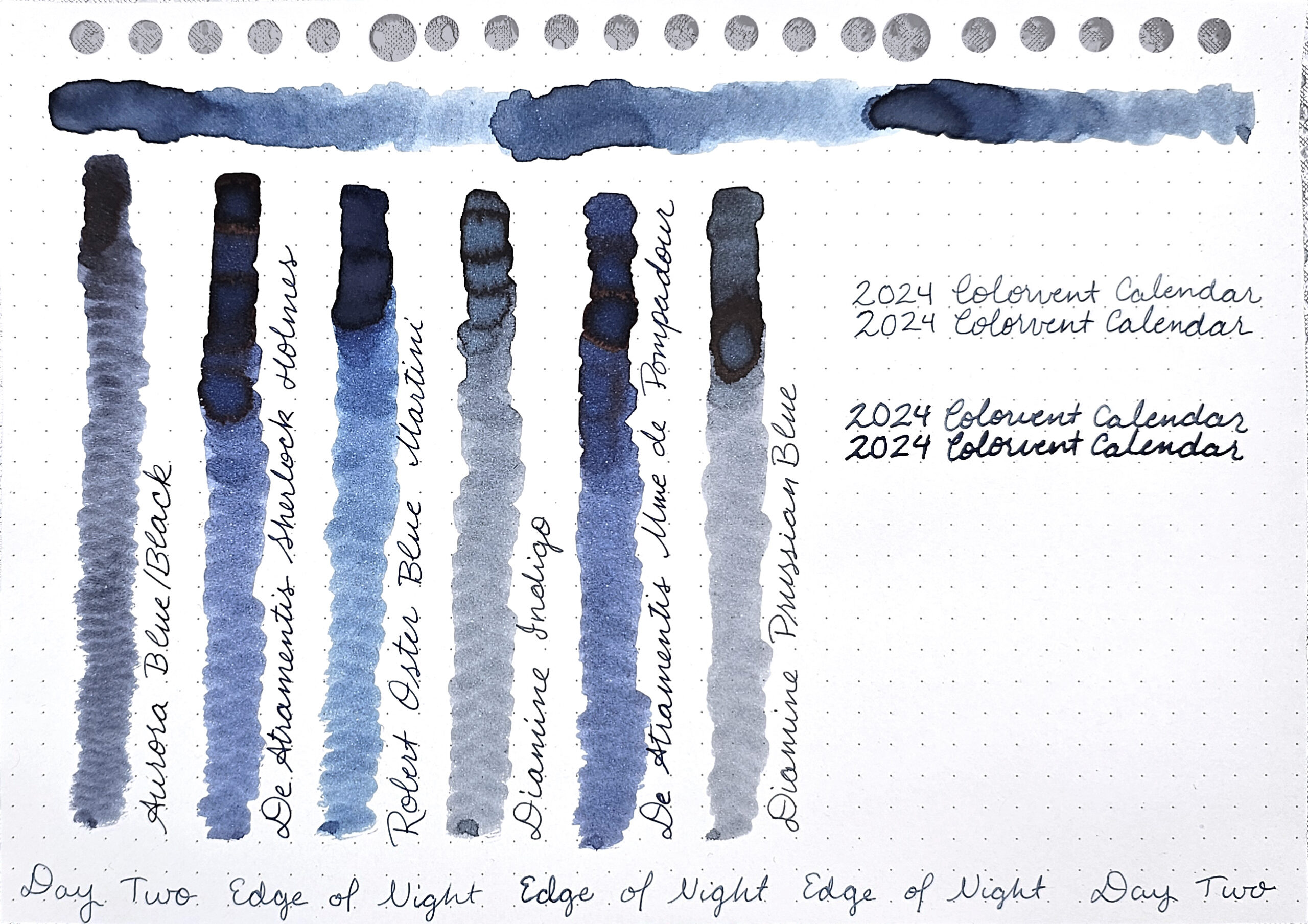
Day 2: Edge of Night

Edge of Night is a muted blue with some slight hints of pink or purple multishading. It builds to significant amounts of shading.
Colorverse’s description for day 2 is, “Edge of Night is a color inspired by the dusky moment when night ends and dawn begins.”
Comparison Inks
From left to right, I compared the following inks to Edge of Night:
- Aurora Blue/Black is too dark and does not shade as much.
- De Atramentis Sherlock Holmes is too vibrant, but it shades more than Edge of Night and has some copper sheen.
- Robert Oster Blue Martini
- Diamine Indigo in too muted and doesn’t shade as much, but it has an “aura” that leans toward copper.
- De Atramentis Madame de Pompadour is too vibrant and a bit darker. It seems to have a similar level of shading and has a bit of copper sheen.
- Diamine Prussian Blue is also too muted, slightly more so than Indigo, but has the same copper-leaning aura that Indigo does.
Best Match
The best color match for Edge of Night among those I tested was Blue Martini which is roughly the same hue, but a bit too dark. It shades significantly darker than Edge of Night does. I think you could lightly water down Blue Martini and end up with the same color as Edge of Night. However, if you are writing with an F or EF nib, you wouldn’t really notice the difference between the two even at full strength.
Jump to a day: ⇡ Supergiant | ⇡ Edge of Night | Moonlit Veil | ⇣ Sailing Stones | ⤒ Back to Top
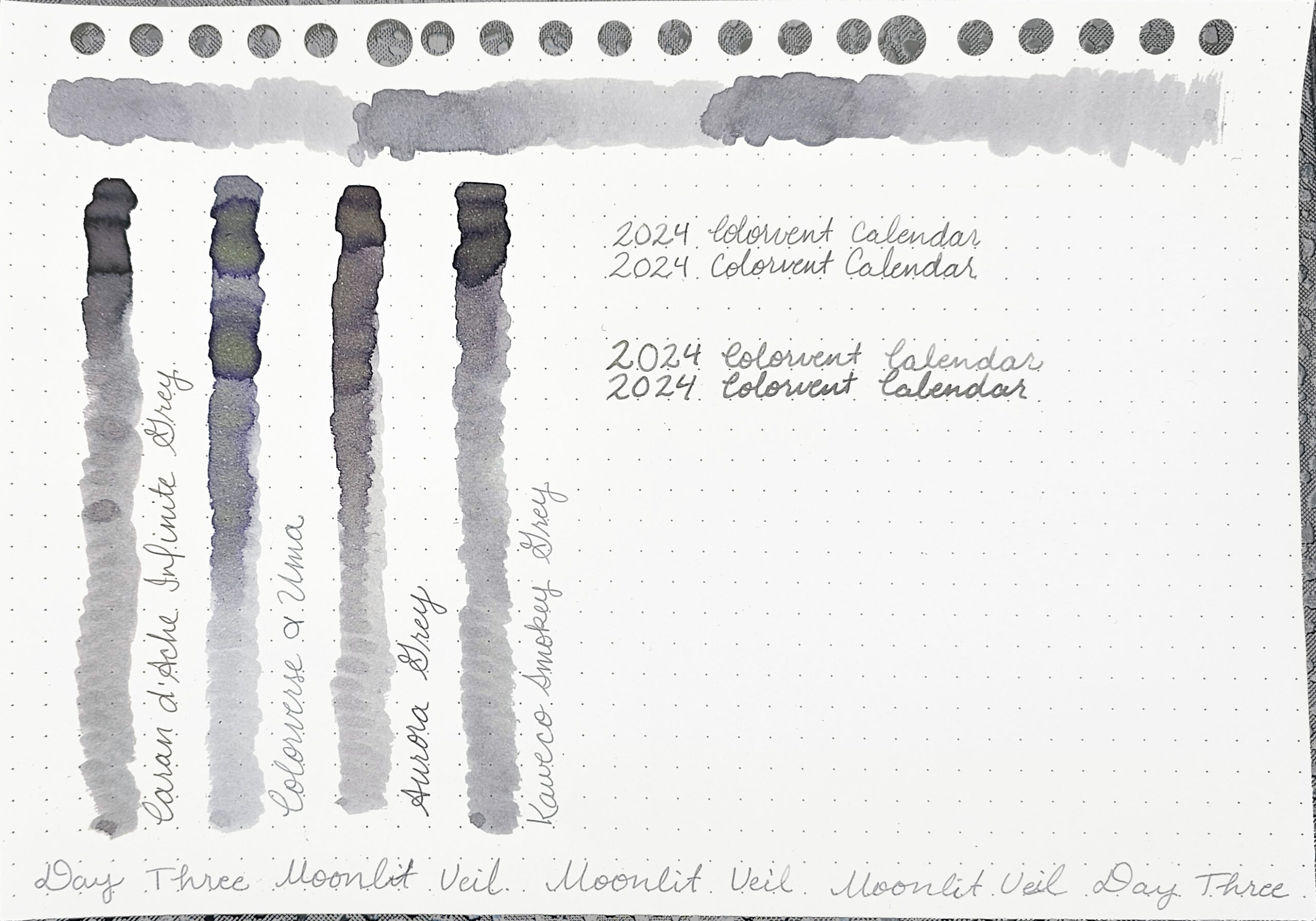
Day 3: Moonlit Veil

Moonlit Veil is a pale gray similar to graphite from an H pencil. It has enough shading to be interesting.
Colorverse’s description for day 3 is, “Moonlit Veil is a color inspired by the moment when the moonlight softly illuminates a dark night.”
Comparison Inks
From left to right, I compared the following inks to Moonlit Veil:
- Caran d’Ache Infinite Grey is too dark, and shades to significantly too dark. The hue is very close, though, so you could probably water it down to match Moonlit Veil.
- Colorverse α UMa doesn’t look anything like Moonlit Veil in the swatch, but the writing isn’t too far off.
- Aurora Grey is a bit too yellow and also too dark. It shades almost as dark as Infinite Grey.
- Kaweco Smokey Grey
Best Match
The best color match for Moonlit Veil among those I tested was Smokey Grey which is a very similar hue, but a couple of shades darker. You could probably easily water it down to a near-perfect match. Infinite Grey looks to be the same hue, but even darker, so it’s the runner-up match.
Jump to a day: ⇡ Supergiant | ⇡ Edge of Night | ⇡ Moonlit Veil | Sailing Stones | ⤒ Back to Top
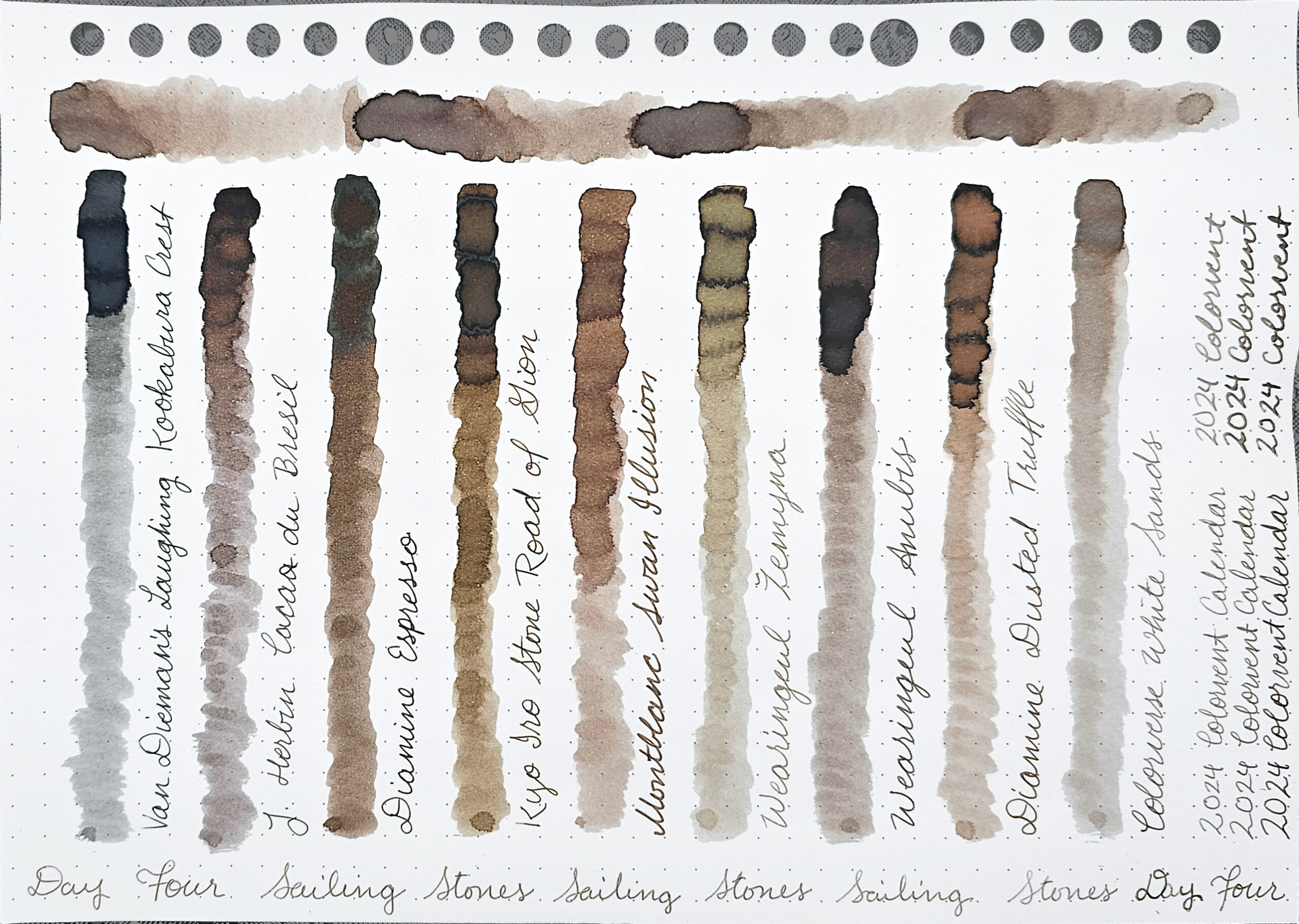
Day 4: Sailing Stones

Sailing Stones is a muted pale brown. It shades quite a bit, but has a grayish, almost chalky look to it when you lay down enough ink.
Colorverse’s description for day 4 is, “Sailing Stones is a color inspired by the phenomenon of sailing stones, rocks that seem to move on their own.”
Comparison Inks
From left to right, I compared the following inks to Sailing Stones:
- Van Dieman’s Laughing Kookabura Crest was a mistake. I misread my list of inks to compare to Sailing Stones.
- J. Herbin Cacao du Bresil is too purple and shades too dark.
- Diamine Espresso is too vibrant and too dark. The shading is about the same, but it doesn’t have the chalky look. It does have a gray aura to it.
- Kyo Iro Stone Road of Gion is too yellow and slightly too dark. The shading levels are similar, though, and it has the chalky look to its heaviest ink areas. It also has the gray aura.
- Montblanc Swan Illusion is slightly too vibrant and too orange. It does not have the chalky look, either.
- Wearingeul Žemyna is too green and doesn’t shade anywhere near enough, although around its shading, it has dark outlines. Žemyna is a shimmer ink, but I let the shimmer settle before swatching it.
- Wearingeul Anubis is slightly too dark and shades darker, without the chalky look. You could probably water it down to have a near-perfect color match. Anubis is a shimmer ink, but I let the shimmer settle before swatching it.
- Diamine Dusted Truffle is slightly too vibrant and too orange. It has the same dark outlines that Žemyna does. Dusted Truffle is a shimmer ink, and while I let the shimmer settle before swatching it, there is still some visible in the heaviest application areas.
- Colorverse White Sands
Best Match
The best color match for Sailing Stones among those I tested was White Sands which is a tiny bit lighter. The difference is less noticeable in thinner or drier pens, but becomes more noticeable the more ink gets put down. If you don’t like light inks, I’d advise going with Anubis as the second-best match, which is about as much darker than Sailing Stones as White Sands is lighter.
Jump to a day: ⇡ Supergiant | ⇡ Edge of Night | ⇡ Moonlit Veil | ⇡ Sailing Stones | ⤒ Back to Top
Thanks for reading to the end, I hope you enjoyed my post. What was your favorite color from this week? Are there any you’ll want to get later, or do you already have some of the dupe inks? Let me know in the comments! I’d love to hear from you.
Make sure to subscribe to my blog or follow me on Instagram so you don’t miss any posts. I generally post at least once a week.
Hi Rachel. I hope you will continue reviewing Dupes again this December! I love your art and reviews!
It’ll be different in format than last year because I’m running behind, but yes, I’m back to the Inkvent Calendar this year.